Tuesday, 15 November 2011

Work Update

Since Friday's meeting and evaluation I have continued weaving to my heart's content and have.....

-Completed two more samples on Loom number 5 (the one with the cotton and elastic/silk warp). Whoever initially threaded up the loom made countless mistakes crossing threads etc so I have to rethread the whole thing which slowed down progress significantly. After initially experimenting with toile on the elastic bands and more elaborate weave structures on the larger cotton bands I was told to stop. We were only supposed to use simple toile on this warp and chose appropriate colour threads as its aim was to experiment with a fabric textured by the warp. I suppose that a complex pattern would make the whole cloth far too fussy. It's just ever so tricky to get just the right amount of tension on both warps and especially to ensure the lycra warp is pulled taught enough or else no ripples will form!


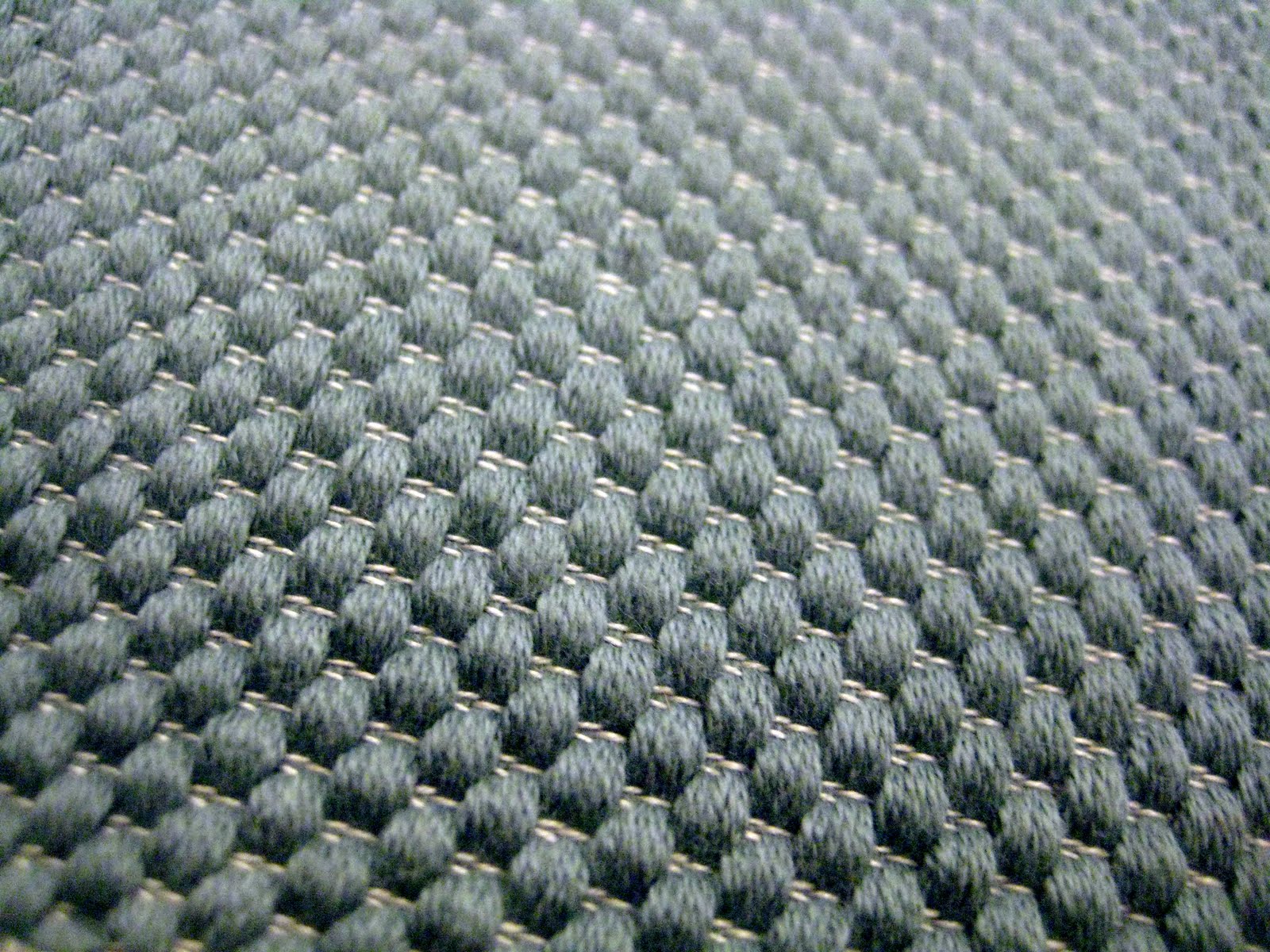
-Returned to work on Loom number 1 (Linge de maison- nappe). I wanted to create a simpler linen cloth with my heart motifs so chose to redo this with a dark grey linen thread. I also wanted to experiment with creating a more textured cloth. Texture is something which really appeals to be as a textile designer.


By doubling up my cotton thread I have created a bobby surfaced cloth which I believe fits the purpose (tea towel fabric) as it would be ultra absorbent. Clothilde has argued that it would be too thick but I would like to wait until it is cut off the loom to truly be able to asses this.


I also decided to redo a Gauffre sample using smaller patterns so that the threads would float on the surface of the cloth less and therefore it would be more durable. I decided to tone down the colours and use a mixture of 2 grey linens as I am fully aware that some of my collections are far too jazzy as far as colours are concerned. However I do think I prefer the original melange of colours I used in my first Gauffre sample as it is rather more feminine!


-I have also done a couple of extra samples on Loom number 8 (with the nasty green, white, grey and blue stripes).
Firstly I wanted to do a plain sample using the weave I used on a previous cloth but omitting the dark stripes this time. It's a bit difficult to see this with it still on the loom as the dark shadows of the loose warp threads hanging beneath the cloth are still visible.
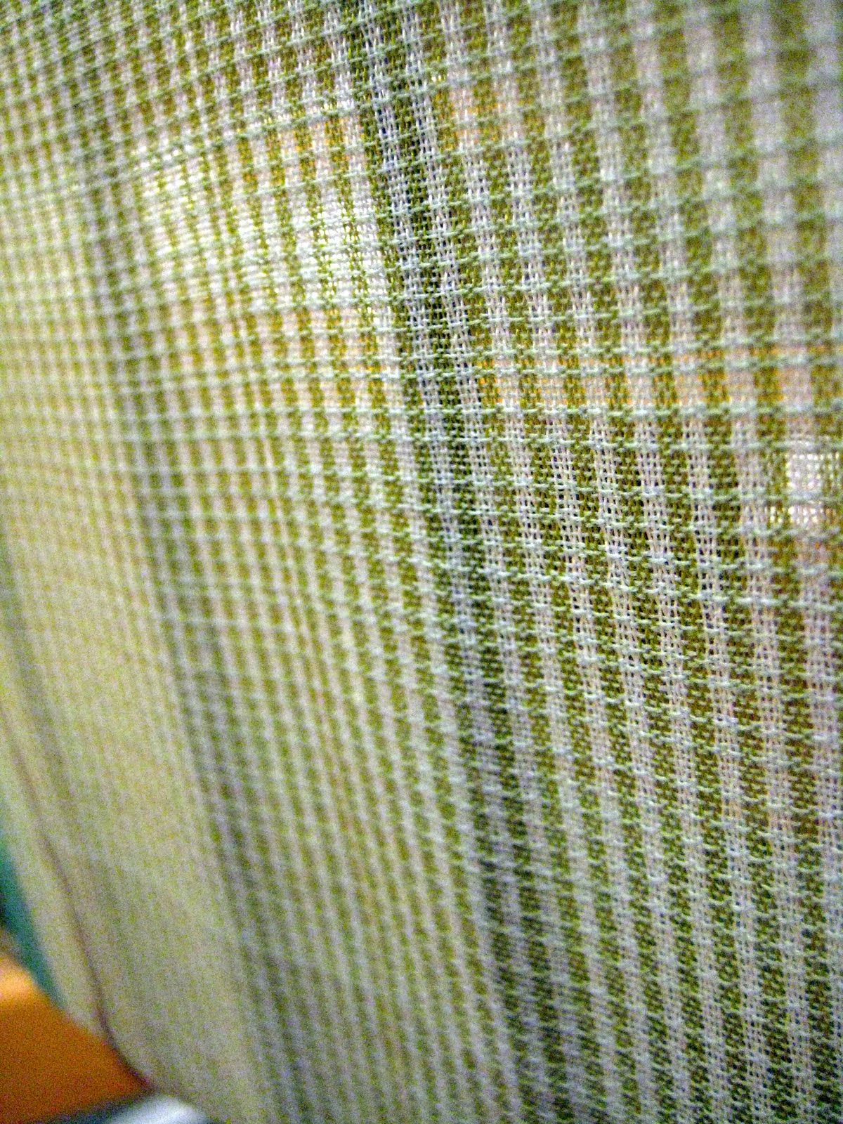


Also, during my evaluation and contemplation I realized that during my time working on this particular warp I became obsessed with the green and white check and therefore this came to dominate many of my samples. I have no idea why I adopted this as it really does not fit into any of my colour schemes. Therefore I decided to do another sample using burgundy and grey warp threads to mask the striped warp. I also designed a little triangle motif which I thought was rather reminiscent of the angular shapes of my minerals.


-And finally I returned to Loom number 10 to redo a silk, stripy sample in a more neutral colourway. In my opinion, sometimes samples look a bit dull and uninspiring on their own, but I know that once within a collection they are as important as the stand out, eye catching pieces to crete a good visual harmony and balance.

Sunday, 13 November 2011

To Do List

I am a lover of lists. And I find it increasingly easy to use pictures to make more of a visual list as my descriptions of samples can be very confusing and end up getting me in a right pickle. After Friday's Rendez-vous I have a lot to be getting on with and with only a week left in weave I had better work super hard this week.

1. Do a silky, stripy cloth for group 3 in order to have a finer, softer fabric in this group. (Possible colours- grey and light green).


2. Redo hearts without white stripe (or as my teacher calls it- a trou (hole)). Perhaps in group 4 colours or something simpler like a plain grey.


3. Redo my pocket (double cloth) sample in different colours. I have an abundance of light blue and pink pieces so use group 4 colours instead. Collection 4 also lacks a wooly sample.

White yarns- find a yellowey wool
Blue yarns- darker blue

If this doesn't work aesthetically then I should try and dye the sample.


4. Gauffres. Such a pretty sample with the flecked colour but threads can be pulled from the fabric too easily. I must redo the sample with a finer gauffre pattern perhaps in group 4 colours?


5. The colours of this sample are really grotesque. I think I was concentrating on diminishing the dominant stripes far too much and actually all notion of colour went out the window. I should either do this piece again, but instead of green and white, use a grey and burgundy to try and mask out the other colours. Otherwise I could attempt to dye this sample (in a casserole as Clothilde calls it) a grey or navy blue and see what happens.


6. The ground weave is really subtle and such a delicate colour and pattern. I believe it would work well as an all over pattern. To do this I must banish the awful grey and blue stripes of the warp to weave only with the more refined white an green stripes.


And the list goes on....

7. Cut tweed samples off loom.

8. Do a dark blue tweed (group 4).

9. Silky orange sample on cotton/ lycra warm using lycra in weft aswell.

etc etc. Or as they rather aptly say in France "et tout le bazar".

Evaluation

Friday proved to be an interesting day for me as I took the time to look through all the weave samples I have created so far and grouped them into 4 coherent collections.

It was surprising how many samples I had created as well as how easily I had drifted away from my original themes and colourways- something I do, unfortunately have a tendency to do! Comparing samples allowed me to evaluate their success and to make informed decisions to not use certain samples which didn't reach an acceptable level of quality or aesthetically were too weak. On reflection, it is probably something I should have done at a much earlier stage in order to better monitor and guide my direction. I think I have just been determined to get going on the different looms as quickly as possible due to our late start and the fact that our time is so precious.

I have divided my samples to date into 4 groups (some samples, e.g. the tweed had not been cut yet and therefore I couldn't group them.) Clothilde helped me think about what constituted a collection as it is all a bit foreign to me and not something we have really studied at Chelsea. Each group needed a collection of cloths with different textures and weights (some thick hardy wools and some delicate silks), a combination of both light and dark colours (as well as contrasts, dominants and neutrals), some highly patterned and some plain and some single coloured whilst other multi coloured pieces. Here are a few images of my groups to date.

COLLECTION ONE


COLLECTION TWO


COLLECTION THREE


COLLECTION FOUR


During working on the double cloth loom (loom number 10) I had considered myself to be building up a collection but on reflection my idea of a "collection" was really barking up the wrong tree. In each sample I had used the same colours and same threads. Instead, I should have experimented with different textured yarns and created some simpler one colour pieces to build up a more comprehensive collection. This collection (Collection Four) is seriously lacking diversity at the moment. I need to add some lighter more neutral shades to help crete an equilibrium such as an all light grey cloth. Also at present, the orangey, gold shade looks a bit sparse and random so I should concentrate on making it a dominant within some samples. This is the group I need to enlarge the most and I must concentrate on creating cloth with relevant colour ways.


The time I took to evaluate my work so far was incredibly helpful and insightful. I now realize what I must concentrate on producing during my final week of weave.

Wednesday, 9 November 2011

Atelier D'ecriture Créative

In this weeks class we each composed 4 Haikus inspired by the 4 seasons. I was rather pleased with my efforts as I believe I have captured a subtle essence of each season through words creating evocative imagery, scent and touch.

HIVER

La forêt dense,
Les flocons pâles couvrent,
Les traces de vie.

PRINTEMPS

La rosée douce,
Et l'odeur d'herbe forte,
Acueillent le jour.

ÉTÉ
Au bord de la mer,
Le sable doré gratte,
Entre les pieds nus.

AUTOMNE

Le vent froid mugit,
Les feuilles mortes dansent,
Pendant leur chute.

Contemporary Art Class

After last week's rather disappointing exhibitions I thoroughly enjoyed this week's class and was pleasantly surprised with the high quality of both the work shown and the galleries themselves.

The first gallery was Plateau in the 19th Arrondissement. We were here to see the exhibition Alien Theory with collaborative video work by the Portuguese artists Joao Maria Gusmao and Pedro Paiva. On doing a bit of preliminary research on these artists I was able to find an interesting Guardian review of an exhibition of their's held in Birmingham. Although the work shown in this exhibition was new work, reading the article again after visiting Plateau, I was able to recognize the consistency in their working practice and chosen themes.

http://www.guardian.co.uk/artanddesign/2010/feb/03/joao-maria-gusmao-pedro-paiva


The unassuming exterior of the gallery.


The exhibition featured around 30 of their silent, short films projected by clattering old film projectors. Though some people found the noise irritating and distracting, I was comforted by their nostalgic rattling in the same way that I appreciate the banging of an old loom when I am weaving. As well as the short films, the exhibition also featured 2 entrancing camera obscuras- that of turning bicycle wheels and the delicate flapping of ornate Japanese fans.

The films themselves are dream like scenarios often wavering between the boundary of reality and fiction, wit and poetry. The artists draw influence form science fiction, myths and proverbs, ethnography and paranormal phenomena. Some focus in minute detail on simple events and occurrences such as the splash of a stone into a lake or the movement of a bird in front of a painted background. They give us a real sense of anticipation, of the imminent arrival of action which ultimately never comes. Timothy said that the artist like to play on the idea of boredom. But not once during the whole exhibition was I bored. I was truly captivated.

Other films told a narrative and gave me the impression they were concealing a hidden meaning. For example the pained expression of the blind man eating the watermelon or the chimpanzees who were fishing potatoes out of a pot which at first sight appeared to be full of boiling water. Though we the viewer interpret the water to be boiling and therefore dangerous to touch, the chimpanzees are evidently clever enough to realize actually an artificial trick and the water is merely bubbling by the presence of an air pipe but is totally cold to the touch. Are the artists trying to point out the ignorance of humans? Many questions remain unanswered and the guide informed us that the artists refused to give an explanation of their work. They prefer people to draw their own conclusions.

I was particularly drawn by the magical ambience of some of the films which showed a process. Such as the footprints which are used like casts and filled with liquid metal to create replica metal feet, or the slow spaghetti making process which was more like a hypnotic exercise. Not to mention the fruit which appear to be hovering and dancing as if acting out a balletic scene. It is by no accident that the artists have allowed their strings and other low-budget, low-tech special effects to be visible. They deliberately want to reveal to us the mainsprings of their making, which I believe adds to their innocent and naive appeal. In addition, the old method chosen means that the appearance of the films will become increasingly grainy and their quality will deteriorate with use. Many of the industrial design students struggled to comprehend this desire to age their work but I found it gave the films a softer more endearing appearance which added to their mystery and intrigue. The slow pace of the films also created a rather sombre and melancholic atmosphere which really gave one time to ponder the subject.


Within the Guardian review, I found these two quotes particularly relevant and poignant in relation to the exhibition-

"Inexplicably beautiful, arresting and incomprehensible"

"like some kind of old scientific demonstration film- except one is never exactly sure what is being demonstrated, or why".

The second exhibition continued the theme of surreal experience but in a completely contrasting way. The exhibition at Bugada & Cargnel Cosmicgalerie was the Works of Julio Le Parc from 1959-1971 entitled The Eye of the Cyclops. Much of the work was very interactive and reminded me a little of the Science Museum in London.

The work was very futuristic, innovative and rather surreal. It also possessed a dream like quality but of a totally different genre to that of the previous exhibition. The contrast between the two exhibitions, of nostalgia and silence versus technology and energy worked well. And despite their differences, I enjoyed each as much as the other.


We finished the evening once again in a tiny Parisian bar which was so stereotypically local, it felt as though we were entering a film set. I suppose this aptly carried on the dreamlike nature of the evening. With old, dusty Moroccan carpets on the table tops and a weathered old man in a suit serving behind the bar I felt like Alice in Wonderland. What a fabulous end to an enjoyable evening.


Tuesday, 8 November 2011

Loom number 5

PEKIN TOILE/ TOILE OU CANNELÉ/ SATIN

CHAINES- 1. COTON
2. SOIE/ LYCRA

VÊTEMENTS


I have just started weaving on this loom which is quickly becoming the bain of my life! In order to achieve the desired outcome- a textured scrunchy fabric, the two warps must be woven at different tensions. The lycra warp at an extremely tight tension and the cotton considerably looser. Achieving the perfect equilibrium is proving to be very difficult and if I had a pound for every broken thread I had fixed...well I wouldn't be desperately needing my erasmus grant! For one I think the cotton is very fine for such a complex warp- 2/120mm and in future I would probably try and avoid using such a fine, fragile cotton. Also our teacher has been ill for nearly a week now so with no one to advise on the perfect tension it's all a bit trail and error. I'm also struggling to find a suitable weft yarn which doesn't slip against the warp. I firstly tried with cotton yarns of the same diameter as the warp but found these too easy to pull apart on form holes in my cloth. As you can imagine, progress has been extremely slow but I will persevere!


Inspiration.

Walking through the workshops is always really inspirational. Whilst in first year, pupils are obliged to create straightforward pieces of cloth with simple weave structures and suitable yarns in the third year more freedom to experiment is allowed. And by the looks of their work this year, the results are truly incredible! It must be a release of all the pupils imaginative ideas that have been building up over the years. A girl called Claire has been working on a woven light structure. By using thick cord and wire covered in silk and weaving in occasional led lights she is creating long woven strips which will then be attached together to create a really unique and highly innovative alternative to the traditional bulb and shade!

Another weave which has caught my eye is this highly textured and vividly coloured cloth-


To help me to better understand its creation, I went back onto Loom Number 9 (the double cloth loom) to create a padded sample. Obviously my two warps were considerably different. For a start instead of cotton I had wool warps and also whereas both hers were out of the same yarn, mine were of different yarns and of different densities.


My initial sample was totally unsuccessful. My piqué pattern (pattern caused by the appearance of the underneath warp on the top face of the fabric) caused a few problems as far as the stuffing was concerned. A combination of too fine a pattern with too thick a stuffing yarn caused my stuffing to burst through the ground weave and become visible. After this I decided to keep things a little easier by simplifying by pattern so that the cloth resembled textured bands of different colour. This worked better although it didn't really have the X-factor I was hoping to achieve. My teacher said I could not achieve a more textured cloth which actually worked as a usable fabric on this warp. At least I have learnt the general method and can think about ways of increasing its visual impact in my weave work back at Chelsea.