Tuesday, 13 December 2011

Evaluation of knit work


This was an interesting practice of analyzing my knit samples as a whole in order to see how well they corresponded with my point of departure, the Munch painting. It was mostly a case of looking to see whether I had used all the possible colours within the painting or whether, as was the case for me, I had concentrate too many of my samples on a certain colour group or only dark colours. I lack many of the bright colours but especially one coloured samples to add calm and bring the collection together as a whole, such as the white snow, the dark green of the trees and the grey of the sky, Cora suggested I do some plainer, simple jersey samples as opposed to always trying out complex knits. On reflection I should have probably got my samples out nearly everyday to see and keep up to date with which colours and techniques I had already used. Remaking the colour composition of a painting through knit samples is still a rather unfamiliar and unusual concept to me. It definitely sets you defined boundaries which I suppose is good as otherwise one could get carried away with sticking to one particular colour, a problem which had troubled me during previous projects at Chelsea. It is however a little frustrating when you are wanting to try a technique out with a particular yarn. As the school do not have a very large colour selection in each yarn Cora will ban you from using it!

Sunday, 11 December 2011

Knit update.

I have learnt another technique- vanisage (colour change) grids. These can vary in width, height, sporadically appear etc. It's actually fascinating studying each technique in detail as you suddenly realize how that jumper or that cardigan you've been wearing for months has actually been made. It's a pretty tricky technique to master though as you have to make sure you've picked the right sort of threads or the whole thing will keep falling off.


The organized chaos that is my knit desk-


Back to the painting and I am on a mission to find the perfect shade of red and blue to match the two figures in the foreground. Definitely harder than it seems and without the ability to dye yarn (this is one thing that ENSCI lacks) you have to make do with what's on offer. Basically it takes a lot of experimentation with mixing finer yarns I suppose a bit like mixing paint out of timy amounts of pigment. Oh that reminds me of my dreaded colour work!


Thursday, 8 December 2011

More Vanisage knitting

Further experiments with the vanisage technique-


Noppé 2.


Noppé 2.


Bourrelet.


Bourrelet.


Noppe 1.


Cote with rayures (difficult to see stripes due to sporadic quality of fluffy yarn used).


Bourrelet.


Bourrelet and varieur behind.


Both Noppé 1.

Cora tells me that I am concentrating too much on the darker colours within my painting of inspiration and therefore I must make more effort in capturing the lighter, more neutral shades. It is fascinating how different yarns look when knitted in comparison to on their bobbin. That is the great thing about all the yarns here being free. You are able to experiment even with yarns that may initially look ugly and undesirable without thinking "I've got to like this I've just bought 60m!".

Wednesday, 7 December 2011

Tonight's Contemporary Art Class

Ok so venturing to the other side of the river and the 6th arronsissement was a little disappointing. Not from the point of view of the art on display but just the fact that most of the better galleries were in between shows or only open for private vernisassages this evening. I guess we were just unlucky. Anyway we still managed to pack in a few galleries.

1. GALLERY- In Situ Fabienne Leclerc
EXHIBITION- Damien Deroubaix - Homo Bvlla

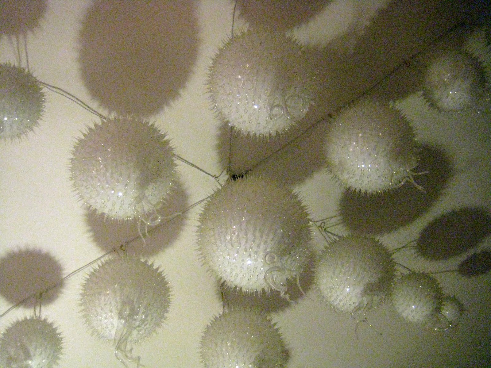
This gallery space was large and airy and allowed for plenty of space to see the work clearly. The artist's most recent work explores the medium of glass which he blows into shape before drawing into it's surface. The word 'draw' is probably not completely fitting to explain his image creation as he etches into the glass through cutting, grating and scraping it. His aim is to breath form and life into such a fragile material. The other works displayed were installations, paintings and etchings. Many had strong mythological and historical references namely the Danse Macabre (Dance of the dead). Though using particularly sombre imagery, I felt the work was not overtly morbid and pessimistic but rather had a mysterious, calming and almost dreamlike quality to it.


2. GALLERY- Galerie Janos
EXHIBITION- Série Noire- Loredana Rancatore, Laetitia Schlesser-Gamelin, Kohei Matsushita.

This was one of many group exhibitions currently on in the area. Timothy told us that this time of year, with Christmas approach group exhibitions are extremely popular within the more commercial galleries. He also told us that this exhibition was not at all what he was expecting and had he seen it previously he wouldn't have bothered bringing us here. The work was definitely not his cup of tea, he found it exceptionally boring and uninspiring. While trying to question him later about why this was he was unclear how to explain his feelings. I get the impression he is more into political art. Art which isn't necessarily of any aesthetic greatness but with a strong message, such as that awful Float last week. I myself found the work in this exhibition exquisite in craftmanship and care as well as being visually appealing. You didn't wonder what an earth you were looking at but instead studied the beauty of the objects presented. Maybe this is 'too easy'. Perhaps the purpose of contemporary art is to be more complex, more controversial and more confusing. I don't know.

Anyway back to the black exhibition-


These panels of carefully placed thin segments of slate were refined and elegant. Suggesting movement, almost like a gust of wind which had swirled and shaped them, I found them very organic and natural looking.


Another artist had arranged a large wall hanging composed of squares of wood. What was interesting was that the wood was coloured by being burned at different temperatures to achieve different tones.


We passed by another gallery, it's exhibition unopen until saturday which had an unusual courtyard installation- a roof formed form old bits of found wood e.g. disused kitchen cupboards etc. It gave a real otherwordly atmosphere like entering some sort of mystical location.


3. GALLERY- Perimeter Art & Design
EXHIBITION- Aldo Bakker

This gallery specifically exhibits design work as opposed to artwork. Timothy asked us whether placing functional, design objects within a gallery environment made us think differently about them. I suppose it is quite an unusual concept as it is almost like entering a smart shop as oppose to a gallery and I believe that functional objects are things one needs to touch and feel. You certainly do not feel allowed or encouraged to do this within a gallery environment which makes the design objects feel a bit unaccessible and hard to relate to.

I'm definitely not convinced by the design gallery concept. I would prefer to see art within a gallery. This concept almost offers an excuse to make the objects seem more exclusive and therefore more expensive.


2,000 euros for a chair anyone?


4.GALLERY-Galerie Vallois
EXHIBITION- Expositions Hors les Murs 2011 & Jeff Mills- Josephine Baker: Something Else

This group exhibition was what I would stereotypically imagine as a contemporary art exhibition. With no explanation, you left feeling overwhelmed, confused and with a head full of questions. Contemporary art is more often than not about the concept, the meaning, the process during which a final outcome is achieved. Often, the final outcome is the least important thing. That's the impression I get anyway. Especially with that horrendous Float from last week that I keep referring back to. It was almost as though the artist had spend so long researching theories and philosophies that he realized he only had a week left to actually create something visually. I wouldn't call myself particularly old fashioned or a traditionalist but it really does strike me that many artists these days see themselves more as prophets sent to educate the masses. Their role is not to create something admirable for us to simply appreciate and comment. So when faced with a group exhibition packed full of these 'final outcomes', one is bound to be left feeling baffled in the least.


Being a colour fiend I was particularly inspired by the photographs of melted car lights. I'm not entirely sure of the meaning or messages behind the images but perhaps it is related to the French (and in particular Alsacien) tradition of burning cars on New Year's Eve.


5. GALLERY- Galerie alain le gaillard
EXHIBITION- Les Masques - Théodore Brauner


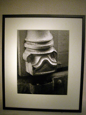
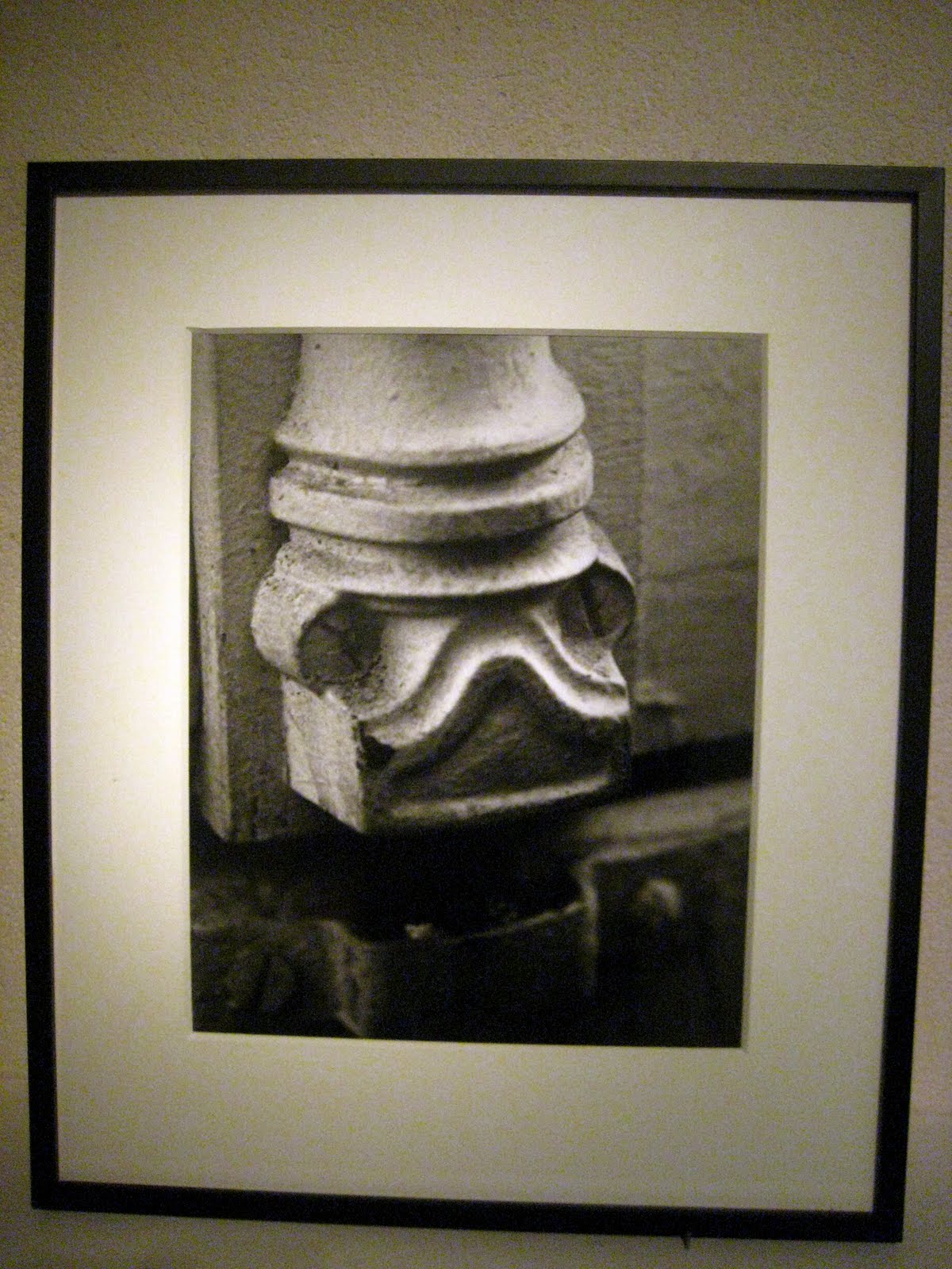
On the top floor of this rather poky gallery where unidentifiable images of what one could only call splodges. No explanation or text to be seen and horrendous lighting, we quickly moved to the basement. We were greeted by many black and white photos capture tubes, wires and other nondescript objects as faces or masks. Timothy was horrified at the work! He found it ridiculously old fashioned, dated and a total disgrace for it to be shown in a contemporary gallery. It did however bring a smile to myself and remind me of my art foundation days when for one short project we were to search for the letters of the alphabet in the environment. I think it's interesting to look for symbols and images where you least expect them.


And to finish..... a well deserved chocolat chaud à l'ancienne and a heated debate over the evenings visits with the group. What better way to spend a Wednesday evening in Paris!

Tuesday, 6 December 2011

Knit colour techniques

We have been furthering our knowledge of all things knit by exploring colour effects using the machine and a few added on components. The techniques are called- .Rayures and Vanisage. Whilst one involves an apparatus which divides two threads on the chariot into an A and B hole- the threads need to be switched manually to create stripes. For the other, one must attach a large arm (see photo) which automatically changes the thread used. This is more appropriate for complicated techniques which involve 'charge' such as Bourelet, Varieur and Noppé 1/2.

RAYURES


VANISAGE


I made it to Musée Rodin!


http://www.musee-rodin.fr/en/exhibition/capturing-model

After wanting to go for months, I finally found the time to visit the Rodin Museum and the extraordinary current exhibition- Capturing The Model, Rodin 300 Drawings 1890-1917. The drawing work Rodin completed of a live model was quite independent from his sculpture. In 1896 drawing became a serious carer for him and drawing nudes a daily practice. He was always eager to appraise drawing and in 1910 said "my drawings are the key to my work".

Within the exhibition, the drawings are divided, grouped into specific themes such as cutting out and assembling (collage style) and Dessin Instantané (Instantaneous Drawing) which involved drawing from a live model without letting his eyes look at his sheet of paper. In total, there are 15 groups shown which really demonstrates the diversity in his drawing a skill, which despite having mastered, still remains a relatively unknown talent of his. I am particularly fond of his earlier sketches which are heavily layered. Ink, washes, gouache, hachured pen lines and smudges. The combination of all this medium help build up an image, adding depth and tone to the model's skin and creating a body form. His continuous re-inventing of different techniques show his avid interest in pushing his practice further and experimenting.

The exhibition gave me a real feeling of wanting to start my life drawing classes in London again. But this time leaving my charcoal at home and instead taking inks and pens.

Aside from the exhibition, within the museum and in the beautiful gardens you can see some of Rodin's most celebrated sculptures such as The Thinker. It is a very relaxed atmosphere in which to view the work, almost like wondering around an elegant town house but nonetheless the work is undoubtedly incredible.


Sunday, 4 December 2011

Knitting with colour and adding relief.

I have been continuing with my knitting and thoroughly enjoying it. Despite being able to appreciate the time and slow pace of creation through weaving, there is something equally fulfilling about the quickness of knitting and the ability to experiment with techniques whilst seeing the results almost instantaneously without the constraints of a warp, threading plan etc. I have often been torn between the two and I believe the ability to flit between both specialisms as well as being able to screenprint is something that ENSCI should be applauded for.


The Munch painting provided inspiration for my colour palette I believe I have been able to capture its atmosphere through the careful combination of yarns and the fusion of shades of colour. I am really pleased with the flecked colour within this different Cote Knit samples.


Experimenting with the Plissé and flotté techniques has allowed me to add texture and form into some of my pieces which could form the basis into a whole host of 3D ideas. I am looking forward to Monday's class when we will learn further techniques based on colour, e.g. to create a cloth with a different colour each side.