Showing posts with label Contemporary Art Class. Show all posts

Wednesday, 14 December 2011

Last contemporary arts class

I'm so disappointed that this was my last contemporary arts class with the amazingly inspiring Mr Timothy Perkins. I have definitely seen work, experienced galleries and partaken in debates which have broadened my mind, challenged my preconceptions and taught me a significant amount amount Paris's social structure, different quartiers and arts scene. It really has been a priceless experience and I feel so fortunate to have made friends with people from such different cultures and walks of life.

So anyway. Back to the last session. Timothy sent us a rather sarcastic email describing how we would be heading right into the heart of hardcore commercialism. As if we were going to sleep with the devil. The galleries we would visit would symbolize the success in Contemporary art fro a Capitalism perspective but equally a way of measuring the gallerist's success. I know he was being sarcastic, but this negative stance made me apprehensive as to whether one should really 'like' the art shown within such establishments. Nonetheless I headed along with an open mind. And actually found the work incredibly impressive. As another student Gemma said, we felt a little guilty liking the work with it's strong consumerist driven attraction, but it was difficult not to appreciate the talent. Unlike the galleries in the 6th last week, which displayed art one would describe as only really decorative objects, this week the concepts, working process and final outcomes were all equally honorable.

These galleries could not be more opposite than the modest spaces offered in the likes of suburbs such as Belleville. I suppose you would call them 'The Ritz' of the galleries. In impressive buildings, with several vast floors, multiple exhibitions, their own libraries and in some cases a second branch in another european country.


This weeks session took us first to the renowned gallery of Yvon Lambert. The first of three exhibitions was by German-born, New York based, Brazilian artist Janaina Tschäpe. At first I was captivated by her drawings. Her style was extremely expressive, flowing and organic. With shapes and colours mimicking bloom and decay that look so appropriately inspired by her deep understanding of the natural world. Her desire is to present not only her impressionistic representations of natural landscapes but also pieces that envelope the viewer and are landscapes in and of themselves. As I proceeded to move through the series I became less convinced by the imagery. I feel the artist took on an increasingly illustrative style which verged on being girly and overly pretty. The energy, emotion and freedom of the first few images seemed to have completely disappeared.


Having said this, I could appreciate this work far more than the other two exhibitions which were too conceptual for my liking. In particular, the work of Koo Jeon-A totally lost me. However, the fact that it was her 7th personal exhibition at the gallery convinced me that there must be more than meets the eye to her haphazard, in situ installations. I gathered that her interest lay in the representation of landscape on a small, intimate scale but without further explanation, my appreciation remained somewhat stunted. This once again raises the question that has been discussed many times during our classes, that of whether an artist should provide a written explanation of their work or not?


From here, we headed to Galerie Thaddaeus Ropac. Perhaps the 'Harrods' of all galleries! The main exhibition was that of renowned photographer Robert Mapplethorpe. As I understand, the artist himself died in the late 80s and this exhibition, curated by Sofia Coppola provides a kind of retrospective of all of his life's work. His photographs left a lasting impression on me. Although at first glance they appear classic, on closer inspection their ambiguous nature and the subtle trickery of the photographer comes to light. Carefully considered detail, such as a nude lady leaning upwards on a sunlounger which gives a parallel image of her propping up the horizon line of the sky keep one captivated and eager to see more.


The other exhibitions in both the upstairs and downstairs rooms were very thought provoking and admirable in their skill and execution. I left without a single doubt as to why this gallery was so successful.


Wondering if things could possibly get any better, we next took a visit to Galerie Karsten Greve to see their collective exhibition 'on paper III', which showcases the work of twelve artists who each use paper in different ways. The majority of the artists I had not heard of before, and therefore I was shocked to see a Louise Bourgeois drawing amongst the exhibits. (See below).


Stand-out artists for me were-

-Raul Illarramendi. This artist explores a personal representation of the errors and traces left through spontaneous activity. At first I thought I had his method all figured out- soft chalk pastels applied and then removed by a finger or a rubber. However what has actually been created is a pencil drawing. A drawing of the non-existent removal. It is all a very convincing trick which must have taken considerable skill in its execution. Timothy, as a friend of the artist, told us how the work organically grows with no preconceived plan. I like this spontaneaty and was truly blown away by the exquisite attention to detail of the work.


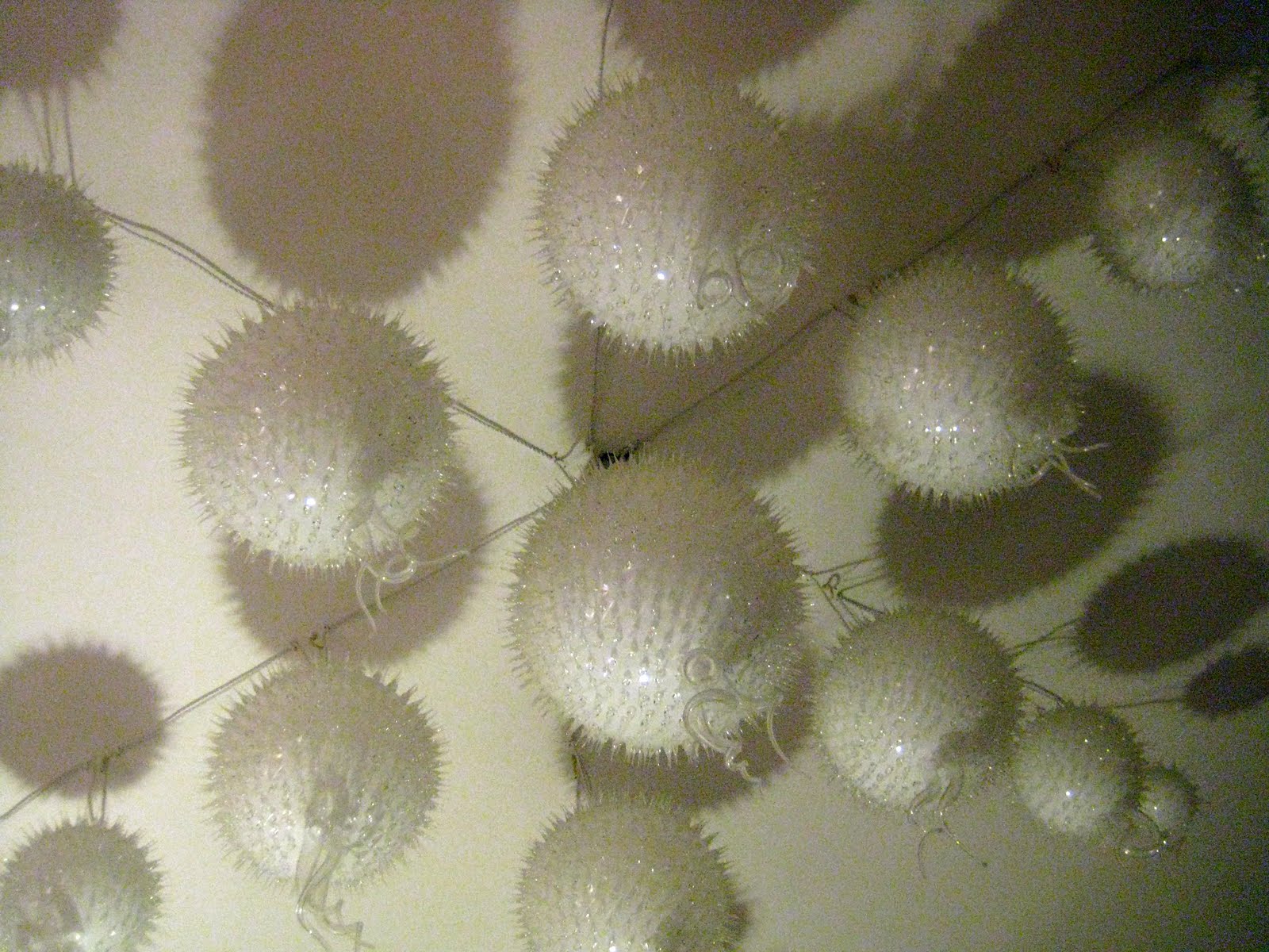
-Claire Morgan. Her drawings and sculptures were extremely fine and almost ethereal in their appearance, With a keen interest in taxidermy, the delicate pencil drawings and colour added with the dried blood of her subjects gave them a haunting appearance.


-Marina Karella. This artist played with the idea of creating soft focus paintings much like one would expect to see in photographs. In order to do this she worked with layers of tracing paper placed over the original painting and then proceeded to paint on top of the tracing paper to allow certain elements to stand out. Such a simple technique, but certainly an interesting way of adding more depth and atmosphere to a painting.


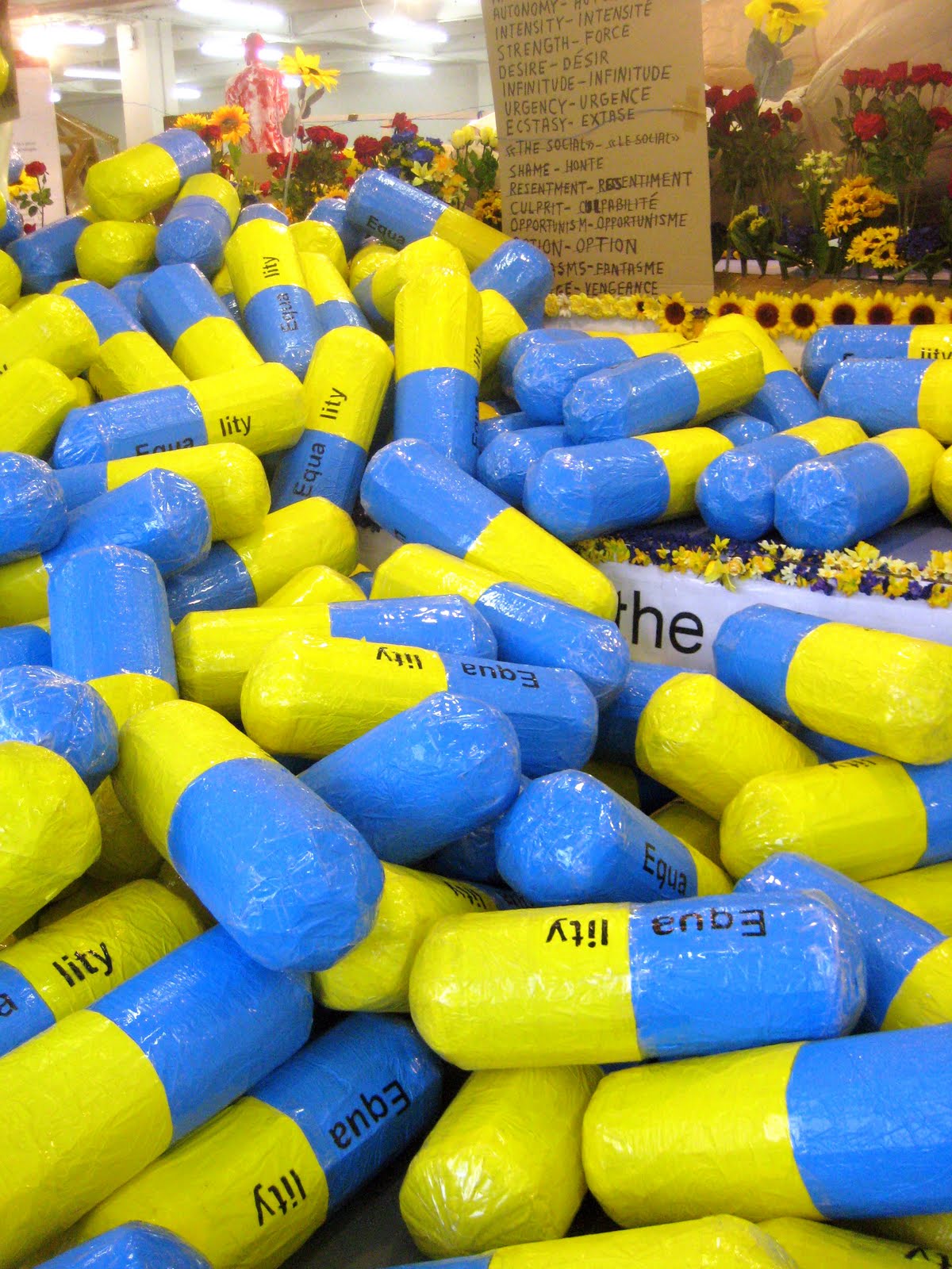
Finally we went to a gallery I had long been wanting to visit since being at its newest exhibition's Vernissage (which was the most extraordinarily intimate Massive attack concert). The gallery was called Galerie Perrotin and its exhibition, by an artist named JR evoked several conflicting opinions amongst the group. Several people took a quick walk around before totally dismissing the work and waiting outside. I personally was intrigued by the work. Watching videos helped explain and provided significant insight into the artists' reasons behind the location and indeed subject of his work.

In brief, JR works by creating monumentally sized photographs which he pastes into a whole host of urban landscapes around the world from walls in the Middle East, suburban buildings in Paris, dilapidated African bridges to being nestled amongst impoverished favelas in Brazil. In his choice to not hold back and use in effect the world as his gallery space I suppose his photographs possess considerable power, strength and impact. The artist himself strives to make us think through "inviting on stage anonymous heroes, displaying the faces of humanity".

His choice to use anonymous local people with interesting faces has certainly roused much curiosity across the globe. Some students thought that these individuals were being "used" by the artist who was taking advantage of their lack of knowledge, culture and total cluelessness that they were the subject of a ridiculously expensive art project. However, on seeing interviews with these people it was actually warming to see how touched they were to be asked and how proud they were to have an image of themselves domineering over their local urban landscape. Timothy struggled to except the location of the work, He argued that it was rather condescending choosing to hang your art work within a poverty stricken favela just so that the backdrop is culturally interesting and colourful. I can see both sides of the argument. In my opinion, aesthetically the photographs are striking and awe inspiring. However there is undeniably some sort of unsettling feeling when this extravagant, high flying world of contemporary art is placed within an environment where even daily life is a struggle that does not sit comfortably within the stomach.


Next week is my final class but unfortunately due to the Textile Department finishing a week before the Industrial Design department I will have already left Paris for home. However, the task of next weeks class is actually a presentation/object/explanation in front of the group of what we have learnt or what has struck us the most during the duration of our classes. Eager not to miss out, I will be watching the group and doing my own presentation over skype next Wednesday. Bringing Contemporary Art in Paris to Wales!

Wednesday, 7 December 2011

Tonight's Contemporary Art Class

Ok so venturing to the other side of the river and the 6th arronsissement was a little disappointing. Not from the point of view of the art on display but just the fact that most of the better galleries were in between shows or only open for private vernisassages this evening. I guess we were just unlucky. Anyway we still managed to pack in a few galleries.

1. GALLERY- In Situ Fabienne Leclerc
EXHIBITION- Damien Deroubaix - Homo Bvlla

This gallery space was large and airy and allowed for plenty of space to see the work clearly. The artist's most recent work explores the medium of glass which he blows into shape before drawing into it's surface. The word 'draw' is probably not completely fitting to explain his image creation as he etches into the glass through cutting, grating and scraping it. His aim is to breath form and life into such a fragile material. The other works displayed were installations, paintings and etchings. Many had strong mythological and historical references namely the Danse Macabre (Dance of the dead). Though using particularly sombre imagery, I felt the work was not overtly morbid and pessimistic but rather had a mysterious, calming and almost dreamlike quality to it.


2. GALLERY- Galerie Janos
EXHIBITION- Série Noire- Loredana Rancatore, Laetitia Schlesser-Gamelin, Kohei Matsushita.

This was one of many group exhibitions currently on in the area. Timothy told us that this time of year, with Christmas approach group exhibitions are extremely popular within the more commercial galleries. He also told us that this exhibition was not at all what he was expecting and had he seen it previously he wouldn't have bothered bringing us here. The work was definitely not his cup of tea, he found it exceptionally boring and uninspiring. While trying to question him later about why this was he was unclear how to explain his feelings. I get the impression he is more into political art. Art which isn't necessarily of any aesthetic greatness but with a strong message, such as that awful Float last week. I myself found the work in this exhibition exquisite in craftmanship and care as well as being visually appealing. You didn't wonder what an earth you were looking at but instead studied the beauty of the objects presented. Maybe this is 'too easy'. Perhaps the purpose of contemporary art is to be more complex, more controversial and more confusing. I don't know.

Anyway back to the black exhibition-


These panels of carefully placed thin segments of slate were refined and elegant. Suggesting movement, almost like a gust of wind which had swirled and shaped them, I found them very organic and natural looking.


Another artist had arranged a large wall hanging composed of squares of wood. What was interesting was that the wood was coloured by being burned at different temperatures to achieve different tones.


We passed by another gallery, it's exhibition unopen until saturday which had an unusual courtyard installation- a roof formed form old bits of found wood e.g. disused kitchen cupboards etc. It gave a real otherwordly atmosphere like entering some sort of mystical location.


3. GALLERY- Perimeter Art & Design
EXHIBITION- Aldo Bakker

This gallery specifically exhibits design work as opposed to artwork. Timothy asked us whether placing functional, design objects within a gallery environment made us think differently about them. I suppose it is quite an unusual concept as it is almost like entering a smart shop as oppose to a gallery and I believe that functional objects are things one needs to touch and feel. You certainly do not feel allowed or encouraged to do this within a gallery environment which makes the design objects feel a bit unaccessible and hard to relate to.

I'm definitely not convinced by the design gallery concept. I would prefer to see art within a gallery. This concept almost offers an excuse to make the objects seem more exclusive and therefore more expensive.


2,000 euros for a chair anyone?


4.GALLERY-Galerie Vallois
EXHIBITION- Expositions Hors les Murs 2011 & Jeff Mills- Josephine Baker: Something Else

This group exhibition was what I would stereotypically imagine as a contemporary art exhibition. With no explanation, you left feeling overwhelmed, confused and with a head full of questions. Contemporary art is more often than not about the concept, the meaning, the process during which a final outcome is achieved. Often, the final outcome is the least important thing. That's the impression I get anyway. Especially with that horrendous Float from last week that I keep referring back to. It was almost as though the artist had spend so long researching theories and philosophies that he realized he only had a week left to actually create something visually. I wouldn't call myself particularly old fashioned or a traditionalist but it really does strike me that many artists these days see themselves more as prophets sent to educate the masses. Their role is not to create something admirable for us to simply appreciate and comment. So when faced with a group exhibition packed full of these 'final outcomes', one is bound to be left feeling baffled in the least.


Being a colour fiend I was particularly inspired by the photographs of melted car lights. I'm not entirely sure of the meaning or messages behind the images but perhaps it is related to the French (and in particular Alsacien) tradition of burning cars on New Year's Eve.


5. GALLERY- Galerie alain le gaillard
EXHIBITION- Les Masques - Théodore Brauner


On the top floor of this rather poky gallery where unidentifiable images of what one could only call splodges. No explanation or text to be seen and horrendous lighting, we quickly moved to the basement. We were greeted by many black and white photos capture tubes, wires and other nondescript objects as faces or masks. Timothy was horrified at the work! He found it ridiculously old fashioned, dated and a total disgrace for it to be shown in a contemporary gallery. It did however bring a smile to myself and remind me of my art foundation days when for one short project we were to search for the letters of the alphabet in the environment. I think it's interesting to look for symbols and images where you least expect them.


And to finish..... a well deserved chocolat chaud à l'ancienne and a heated debate over the evenings visits with the group. What better way to spend a Wednesday evening in Paris!

Sunday, 4 December 2011

Contemporary Arts, Location, Transition.

Almost more important than the work itself this week, was seeing the transition in the genre of work as we moved through different 'quartiers' of Paris. It had never struck me so evidently before, or maybe it has never really been something I have given much though to but when looking for it the change is incredible.

This week we started near République, a street called Rue Léon Jouhaux in the 10th. Those of you who have a bonne connaissance of Paris will no that this area, well especially this street, is not the sort of place you'd expect an art gallery. And you wouldn't be too far from the truth either. After 10 minutes of trying to explain what we were looking for to some shifty looking guys smoking outside the address we had been given, we (I had arrived with the two Italians) were about to abandon hope and go home. The address belonged to that of a large, highly secure Douane (customs) complex. With an underground loading bay area which resembled the dingy collect by car basement in my local M&S back home. After a while, and much exasperation, a security guard came, grabbed us, pointed to a narrow staircase and told us 3rd floor. Wadding through this bizzare top security warehouse was another 'have to be there to believe it' experience. But we managed to arrive safely. And was it worth all the effort.......no not really.

Inside this large warehouse style space was a 21 metres long, by 6 metres wide "Equality Float" by Thomas Hirschhorn, an artist who hs been chosen to represent Switzerland at the 54th Venice Biennale.


The Float's purpose was to demonstrate the ills and remedies of our community whilst highlighting specifically notions of equality and inequality. Crude sculpture, horrendous photographs (e.g. of decapitated bodies) and an abundance of cheap materials such as plastic flowers were displayed amongst banners and slogans. The Float was decisively political, upfront and bold. To supplement his visual work, the artist had supplied a library full of his research books consisting primarily of political and philosophical essays (e.g. Spinoza, Deleuze, Bataille, Gramsci). Without spending hours reading all the additional articles and books it is not crystal clear exactly what the artist is specifically trying to get at. The float itself, I found an aesthetic horror. Whether or not the artist had wanted to purposefully pass comment on the cheap, tacky, mass production and consumerism dominating our society this was definitely one possible interpretation with the cluttered plastic flowers, pom poms and common white garden chairs.

As a group, we were interestingly divided. Some found the work impacting, intelligent and successful. While others (myself included) found the whole thing visually vulgar, unnecessarily crude and lacking in any careful consideration. I am not keen on artists who are overtly forceful with their message. I personally prefer being presented with something I can think about and interpret on my own as opposed to being pressurized into a pre-decided judgment and conclusion. Timothy was quick to tell us not to dismiss the artist before taking a good look at his other work online and especially that which he completed for the biennale. Having grabbed a quick glance I have the impression that it is more mindfully executed.

After this, we headed off to a small gallery the other side of République on Rue Charlot. Hence crossing from the 19th to the 3rd arrondissement. I remember having a bad experience in a grotty hostel in this area last summer- one which necessitated putting money into a meter in order to get a flow of water and the flicker of an ancient light bulb in the communal shower! I had certainly not noticed any swanky modern galleries being in close proximity during that visit!

The gallery was called Galerie Bernard Jordan and the exhibition- "Entre les fantômes du passé" by Cécile Hummel. The title of the exhibition was the only real incline into the intended message and proposition posed by the work. Hence in a total contrast to the "Equality Float" we really did have to do a lot of thinking, self-interpretation and presumption. I was content with this. Both the work and the gallery were peaceful and pleasant. The photographed old photographs were a particular favourite of mine as I am very keen on the idea of re-interpreting and giving a new lease of life to aged objects.


We continued down Rue Charlot, which is a very trendy street indeed (I suppose we were working our way towards the Marais). The group work within the next space- Gallerie Denise René undoubtedly reminded me of the first exhibition we saw within Bugada & Cargnel Cosmic Galerie (the converted garage space which we frequented twice). The work on display was exceptionally 'sciency' and futuristic. Some were real enthusiasts whilst others felt that it had tipped the art-science scales...in the wrong direction. Personally I don't see a defined boundary within the both. I suppose the science approach has more to do with aesthetic qualities and less with meaning and message. More design than conceptual art? But then I am in no mood to get into the art vs design age old debate. I will simply show a few photos and you can make your own minds up.


Next we headed to Almine Rech Gallery to see the work of an American artist, Aaron Young titled Always Forever Now 20.10.11-22.12.11.


I don't really have much to say about this work as I found it rather uninspiring and decisively commercial. An abundance of American flags and stereotypical motifs..... This was work made to appeal to a consumer which had perhaps restrained the artists imagination, I don't know. What's interesting is that the gallery is located within a popular, prime spot so I suppose the rent is high and the need to sell equally as demanding. It is very unlike the far more experimental, 'out there' artwork on display in some of the small galleries in Belleville where rent would be significantly less and therefore artists perhaps allowed more freedom.

We then headed to our final stop (before the final final stop- the bar!), Galerie Chantal Crousel. Interestingly enough, the "Equality Float" gallery is also owned by Chantal Crousel. This was not my first visit to this space. Back when the summer was warming my back I had come her to watch an interesting piece of video work by Melik Ohanian. Now it was the photographic work of Wolfgang Tillmans on display. Tillmans, a german artist was the first photographer to have won the Turner Prize in 2000 and Timothy also told me that he used to be a reputable fashion photographer in London. In line with my comments on the last exhibition and bearing in mind that this gallery is also within the trendy Marais area, the work is visually pleasing but not exceptionally innovative or experimental.


He has captured a lot of natural phenomena which would certainly appeal to a wide market. At this point I think I should explain that I am not meaning to say this in a pejorative, undermining way. It is just passing comment and trying to understand contemporary art and the location of their exhibitions in a more clarified way. I am in truly in awe of these photos and by saying they are commercially minded it does not make them any more or less honorable than the invisible white on white prints of Belleville.

Anyway next week we are heading south of the river and I can't wait to see what interesting delights and discoveries are in store!